January 30, 2008

Your free eBook: The Cheats' Guide to Customizing Blogger templates

I'm really happy to be able to release my first eBook: The Cheats' Guide to Customizing Blogger Templates.
Based on the original article published here, this eBook will offer you many options and examples to customize your existing Blogger template quickly and easily, whichever style of template you are using.!
Read on for more information and to download this free eBook.

Features of this eBook

This eBook is much more comprehensive than the original online article, and features:
  • New examples of template customizations
  • An entire chapter about customizing stretch (fluid) templates
  • How to use buttons, banners and images
  • Many useful resources for template customization
  • An optional download folder containing all of the templates and images used in the eBook

Format

The Cheats' Guide to Customizing Blogger Templates eBook is available in PDF format.
You can download Adobe Reader using the link below:

License

Creative Commons LicenseThe Cheat's Guide to Customizing Blogger Templates eBook is licensed under a Creative Commons Attribution-Noncommercial-No Derivative Works 3.0 Unported License.
This means that you are free to redistribute this eBook for non-commercial purposes, without modification, so long as you include a link to the original author.

Download

Here you can download the Cheats' Guide to Customizing Blogger Templates eBook and also the download folder which contains all of the templates and images used in the guide:
Download the eBook (PDF format)

Cheats' Guide downloads folder (templates, images, etc)

Final words

Please send me an email if you have any questions about the content or usage of this eBook, and I'll get back to you as soon as possible.
If you've found The Cheats' Guide to be a useful read, why not help me spread the word so that others can find this too? It has taken much time and effort to complete this eBook, so I would really appreciate any and all publicity I can get!
I would love to read your thoughts and opinions about this eBook, so please do leave your comments and suggestions below.

January 29, 2008

Styling the header and footer sections (Blogger template design series)

If you've been following the Blogger Template Design series so far, you'll have seen the demonstration template looking something like this. In the series so far, we've created the layout (canvas) for our template, then changed the margins and padding for the main elements. But there is no distinguishing style yet for this template.

So in this installment, we'll look at some quick customization options for the blog's header and footer to pretty things up a little bit, and provide a stylistic base for future customizations so we have a better idea of the overall design we want to work towards.

I've always considered the blog header and footer to stylistically "frame" the main content of the blog, and feel it's important to pay much attention to these areas when designing a custom template.

Broadly speaking, there are two major styles for the header and footer sections of blog templates:

Where the width spans only the width of the content, like this:

Where the width spans the entire window, like this:

In this tutorial, I'll explain how both styles can be achieved so you can choose which style you'd prefer for your own custom template.

Changing the width of the header and footer (for both styles)

For both of the example styles displayed above, we will need to change the dimensions for the header and footer sections, which ensures the content spans the entire width of the blog.

Here's how to do this:

  1. Go to Template>Edit HTML in your Blogger dashboard. Do not expand the widget templates (it is unnecessary for these customizations and can in fact make things more difficult for you!)
  2. Find the width of your outer-wrapper. In the demonstration template, this is 950px, as can be seen in the following section of code:
    #outer-wrapper {
    border: 1px solid #000000;
    width: 950px;
    margin:0 auto;
    padding: 10px;
    text-align:$startSide;
    font: $bodyfont;
    }
    We need to know this width so we can adjust the header and footer wrappers to be the same width.
  3. Change the width of the header-wrapper. Currently the header wrapper in the demonstration template is only 660px wide. We need to change this to match the width of the outer-wrapper. So find this section in your template code:
    #header-wrapper {
    width: 660px;
    border: 1px solid #000000;
    margin:0 auto 10px;
    border:1px solid $bordercolor;
    }
    And change the line highlighted in red to match the width of your outer-wrapper instead. In the demonstration template, the adjustment will look like this:
    #header-wrapper {
    width: 950px;
    border: 1px solid #000000;
    margin:0 auto 10px;
    border:1px solid $bordercolor;
    }
  4. Change the width of the footer. In similarity to the header-wrapper, the footer measures only 660px in width, so we need to increase this width. So find this section of code in your blog template:
    #footer {
    border: 1px solid #000000;
    width: 660px;
    margin:0 auto;
    padding-top:15px;
    line-height: 1.6em;
    text-transform:uppercase;
    letter-spacing:.1em;
    text-align: center;
    }
    And once again change the line in red to match the width of your outer-wrapper (eg: width: 950px).
  5. Make the style for the footer consistent! If we take a look at the template code which calls the footer section, we can see that there is a div called "footer-wrapper" which is not features in the <b:skin> portion of our template:
    <div id='footer-wrapper'> <b:section class='footer' id='footer'> <b:widget id='Text1' locked='false' title='' type='Text'/> </b:section> </div>
    To ensure this doesn't cause problems later on in the customization process, we need to change the style code in the template.

    So find the footer styling in your blog template again, and add the phrase highlighted in red:
    #footer-wrapper {
    border: 1px solid #000000;
    width: 950px;
    margin:0 auto;
    padding-top:15px;
    line-height: 1.6em;
    text-transform:uppercase;
    letter-spacing:.1em;
    text-align: center;
    }

Now if you preview your template, you will notice that the header and footer sections have increased in width and span the whole of the blog.

Making the header and footer sections span only the width of the blog

If you only want the header and footer sections to be as wide as the main blog content, you need make no further extensive customizations to these sections!

If you prefer, you can add a background color to the header and footer wrappers to make these stand out and frame the main content, as I showed in the examples above.

To do this, you only need to add one line of code to both the header-wrapper and footer-wrapper sections of your styling code:

background: #000000;
The hex value "#000000" is black, though you can just as easily substitute this value for the color of your choice.

To add your background color to the header-section, paste the line of code just below this phrase in your template code:

#header-wrapper {
To add this to the footer section, paste the line of code just below this phrase instead:
#footer-wrapper {

After adding a black background to the header and footer wrappers in my demonstration template, the end result looks like this:

This is the style of framing I have used for the Blogger Buster template, which also allowed me to use a background image for the header.

Making the header and footer sections span the width of the browser window

This style of framing the content can look very striking, as it creates bands of color to the top and bottom sections of the blog, segregating the main content from the framing elements and drawing more attention to the blog posts and sidebar sections.

However, it is much more difficult to achieve!

To achieve this, we must take the header and footer sections outside the outer-wrapper, then wrap these in new div elements which span the entire browser window.

It is quite complicated to explain, so I will take you through the process step-by-step:

  1. Add some styling code to your <b:skin> section. This is the simplest part of the process. Simply copy the code below and paste this just before the closing </b:skin> tag in your template:
    #outer-header {
    background: #000000;
    }
    #outer-footer {
    background: #000000;
    }
  2. Take the header outside the outer-wrapper. Find this section ion your blog's template code:
    <div id='header-wrapper'>
    <b:section class='header' id='header' maxwidgets='1' showaddelement='no'>
    <b:widget id='Header1' locked='true' title='Blogger template Design Series (Header)' type='Header'/>
    </b:section>
    </div>
    Now delete this entire section!

    Now we can paste a modified version of this code outside the outer-wrapper, so the header will span the width of your browser window.

    So find this line in your blog template:

    <div id='outer-wrapper'>
    And paste the following section of code immedietly before it:
    <div id='outer-header'>
    <div id='header-wrapper'>
    <b:section class='header' id='header' maxwidgets='1' showaddelement='no'>
    <b:widget id='Header1' locked='true' title='Your Blog Title (Header)' type='Header'/>
    </b:section>
    </div>
    </div>
    <div id='outer-wrapper'>
    Now if you preview your template, the header section should look something like this:

  3. Take the footer section outside the outer-wrapper. We're going to use the same method to ensure the footer section moves outside the outer-wrapper, so that it will not be constrained in width.

    So find this section in your blog's HTML code, and delete the entire section:
    <div id='footer-wrapper'>
    <b:section class='footer' id='footer'/>
    </div>
    Next, find this line in your blog template:
    </div></div> <!-- end outer-wrapper -->
    And paste the following section of code immediately after this line:
    </div></div> <!-- end outer-wrapper -->
    <div id='outer-footer'>
    <div id='footer-wrapper'>
    <b:section class='footer' id='footer'>
    <b:widget id='Text1' locked='false' title='' type='Text'/>
    </b:section>
    </div>
    </div>
  4. At this stage, your template may seem a little maladjusted. This is because the style for the outer-wrapper doesn't feature the required code to prevent it from running into the new footer section.

    This is easily solved by adding the required code to the style for the outer-wrapper in the <b:skin> section of the template.

    Find the outer-wrapper section in the <b:skin> portion of your blog template, and add the lines highlighted in red:
    #outer-wrapper {
    border: 1px solid #000000;
    width: 950px;
    margin:0 auto 5px;
    text-align:$startSide;
    font: $bodyfont;
    word-wrap: break-word;
    overflow: hidden;
    }
    Now if you preview your template, all of the elements should fit neatly into place, like this:

If you prefer, you can change the background color of the header and footer sections by substituting #000000 for your chosen hex value in the style for the outer-header and outer-footer sections (use the Color Calculator in the Tools section to find the hex value for your chosen color).

By now, I hope I have provided enough information for you to format your own header and footer sections to match the style of your overall template!

I know that some of the customizations described here are a little difficult to implement, so if you do have any problems, feel free to leave a comment or send an email and I'll do my best to advise for your own particular template.

Status of the demonstration template

For the demonstration template used to exemplify the tutorials in this series, I have chosen to span the header and footer backgrounds across the whole browser window. You can view the progress of this demonstration blog at any time, and also find links to all previous installments in this series.

Coming soon...

In the next main installment, I will begin to explain how to add interactivity to your header section. Also, I will be posting some resources of inspiration for blog style and design in the next few days to give you some ideas of the header images, icons and color schemes you may like to use in your own templates, which will be helpful to refer to when designing your own schemes.

As always, please feel free to leave your comments and opinions below. I really do appreciate your feedback on this series, especially regarding tutorials like this which are more difficult to explain.

January 27, 2008

Weekly Review #4

Despite blogging less than usual these past few weeks, I assure you I have been very busy! I've found some great sites to tell you all about, and most importantly the eBook is ready for release and will be publicly available on Tuesday!

So without further delay, here's the fourth weekly review for 2008, with news from Blogger Buster, the bloggosphere and interesting links I've discovered this week.

Blogger Buster news

The Cheats' Guide eBook

Sorry guys, I know this has been a long wait. Thankfully the eBook is now complete, with even more added features and also an accompanying folder with new templates and images used as examples in the eBook.

Members of the Blogger Buster MyBlogLog community will be able to have a sneak preview of the Cheats' Guide eBook (for evaluation and feedback) before the public release later this week. So if you'd like to get your hands on the eBook before anyone else, join our community or send me an email and I'll forward on the link.

More from the Blogger Template Design series

For those following the progress of the Blogger Template Design series, we've now taken the template a step further by adding margins and padding tp the template in construction. In the next few installments, we'll tidy up other elements of the template and begin working on one of the most important aspects of any blog template: an enticing and interesting header.

Some small changes to the Blogger Buster site

I'm planning to make some changes to the layout and functionality of this site over the next week or so. These will not be so drastic as last year's complete redesign, but rather a shuffle of the navigation links and sidebar content which I hope will make this blog easier to use and navigate, as well as highlighting the more popular sections of the site.

Blogging news

Bloggies Finalists

The finalists for the 2008 Bloggies have been announced, and we are now able to vote for our favorites in each category.

There are many familiar faces in the list, including Dooce, PostSecret and Lifehacker, plus some new faces in the list. You can also vote for Blogger as the best application for Bloggers if you choose (though Twitter and Flickr look set for many votes too!).

This week's links

I've begun to get into the habit of bookmarking useful links as I find them, so this week I have quite a selection of sites to share, including some which were emailed to be by readers.

I hope you find these useful, and please do send me your own suggestions which I will post here next week.

  • Ximmy: get paid to bookmark your favorite sites

    This new social bookmarking site offers rewards to those most active in the community by rewarding members with credits which can be exchanged for cash. Thanks to Clyde for recommending this.
  • Entrecard

    I'll soon post a full article about this excellent free service as I am very impressed with how well this is working for me. Basically, this allows you to earn and spend credits through advertising your blog, and allowing others to advertise on your site. You can see my own Entrecard widget in the sidebar.

    Already I've noticed an increase in the number of visitors to my site, and I'm really enjoying finding new blogs to read in the process. Check it out for yourself and let me know what you think about Entrecard by leaving your comments below.
  • Tiny URLs: make your long links tiny!

    If you're in the habit of posting long URLs in your blogs or publications, do try TinyURL.com, which can transform your long links into tiny URLS. I've used this extensively in the forthcoming eBook (as my PDF software doesn't support embedded URLs), and have found this free service to be extremely helpful.
  • LetterMeLater: send scheduled emails

    This free service would be ideal for anyone who wants to schedule their blog posts to a later date.
  • Social networking in plain English

    This video post explains how social networking works in a way which is easy for anyone to understand.
  • Larabie Fonts: free fonts for your blog designs

    I found this site while searching for some great free fonts to use in blog designs. There are loads of really great fonts to use here, including Coolvetica (a free variant of Helvetica) which you may recognize from the Blogger Buster logo.
  • Iconspedia: free icon packs

    Here's another great site for those looking for free icons for their blog designs, featuring a wide range of high quality icons for free download. I'll be using some of these in later installments of the Blogger Template Design series, so be sure to check this site out if you need to find great icons for your own blogs.

If you've enjoyed this post, please consider subscribing to the Blogger Buster feed.

As always, your comments and suggestions are always welcome.

January 26, 2008

Reader's Questions: resources to learn basic HTML and CSS

"For a beginner like me, where should I start or what are the basic knowledge that I should learn first for me to catch up with all your posts…"

Here Pak Maeh asks a question which many of you may have wondered at one time or another. While I do try to make my tutorials as easy to understand as possible, it may be helpful for beginners to learn a little about basic HTML and CSS in order to get a better understanding of how Blogger templates work.

So in this post, I'll offer some of the best resources I've found which would be useful for learning the basics.

Blogger resources

The Blogger help section offers some basic advice about working with your Blogger powered blog. Here are some of the most useful pages from the help section:

Other useful resources

Here are some other resources I have found which offer useful information about HTML and CSS which can assist your understanding of how Blogger templates function, and how HTML code can help to enhance the overall appearance of your blog.

HTML for bloggers (Aitec)

This post explains the basics of using HTML code in blog posts, with a table of the most popular HTML tags.

Cedges HTML Cheats

I've always found this site to be one of the best and most useful sites for HTML cheats, and still refer to it now!

Besides regular HTML tags, you can also learn about tables and inline CSS techniques using the useful reference guides.

Faq of HTML

Lists some of the most frequently asked questions about HTML tags.

Barebones guide to HTML

An old but comprehensive guide to HTML tags and structure

W3Schools

A very valuable resource featuring examples, explanations and even "Try-it-yourself" editors, so you can see exactly how each example works in a web page.

CSS Basics

A simple and easy to navigate resource which can help you learn about CSS, from basic to more advanced techniques (thanks to Apisz for the the recommendation)

I hope this resource list is helpful to your understanding of the tutorials and guides posted here at Blogger Buster. If you know of other useful resources which should be added to this list, please feel free to leave your suggestions and comments below.

January 24, 2008

Adjusting the margins and padding in your blog template (Blogger Template Design Series)

Margins and padding are important aspects of Blogger design: they add space between and inside each element of your blog, while ensuring your content is well styled and easy to read.

In this installment of the Blogger Template Design series, I'll share the method I use to change the margins and padding in Blogger templates to ensure a cohesive layout. This post follows on from the previous installment which explained how to change the overall layout of your blog.

Blog margins define the space of each element in relation to each other, while padding defines the space within each element.

In its current state, the demonstration blog used to explain the tutorials in this series is visibly coherent despite that we have not yet altered the padding and margins. However, as we begin to alter each element of the blog template (the sidebars, header and main posts column), we will may notice these elements become squashed together, since there is no space defined between or within them.

The easy way to see how padding and margins will affect your template

Here is a method I almost always use when tweaking the margins and padding of my Blogger templates: add borders to each of the layout elements.

When we transform the template from this:

To this:

It becomes much easier to see how padding and margins will improve the overall appearance of the template!

Adding borders to your layout elements

When tweaking my templates, I find it best to add borders to the following areas:

  • The outer wrapper
  • The header section
  • The Sidebar(s)
  • The main posts column
  • The Footer

To do this, we only need to add a single line of code to the styling for each of these sections:

border: 1px solid #000000;

Copy this line of code to your clipboard, then find each of the following lines in your template. Paste the line you have copied directly beneath each of the following lines in yout template's HTML code:

#outer-wrapper {
#header-wrapper {
#main-wrapper {
#sidebar-wrapper {
#footer {
If you have a three column layout, you will also need to add this in the styling for the new sidebar wrapper:
#new-sidebar-wrapper

Before you save this, you should preview your template to ensure each of the borders is in place. You may well notice a problem with the layout after adding these borders: your sidebar(s) may now be pushed out of place!

This is how the problem looks in the three column demonstration template.

But don't worry: this is easily solved by taking a few pixels away from the width of the main posts column

In the demonstration template, the width of the main posts column is 450px:

#main-wrapper {
border: 1px solid #000000;
width: 450px;
float: $startSide;
word-wrap: break-word; /* fix for long text breaking sidebar float in IE */
overflow: hidden; /* fix for long non-text content breaking IE sidebar float */
}
By taking six pixels from this value (leaving this at 444px instead), we can ensure the sidebars are properly aligned:

How to define margins

As I mentioned earlier in this post, margins define the space between each element in the layout. In the image above, we can see there is no space between the main posts column or either of the sidebars. We can use margins to create space between each of these elements.

However, we must be aware that adding margins to a layout element is almost like adding extra width to them. Unless we take some pixels away from an element, we risk pushing the layout out of place!

With this in mind, let's have a look at the demonstration template again:

We can see there is already some space to the left of the main column, and to the right of the right-hand sidebar (created by padding in the outer wrapper). However, there is no space between the main column and each of the sidebars.

To create this space, we will add a margin to the right of the main-wrapper, and a margin to the right of the first sidebar.

Adding a margin to the right of main wrapper

In the demonstration template, I'm going to add a margin of 10 pixels to the right hand side, which will create some space between the main wrapper and the neighboring sidebar.

To do this, I need to add a line of code to the style declarations for the main-wrapper, which is highlighted in red below:

#main-wrapper {
border: 1px solid #000000;
margin-right: 10px;
width: 444px;
float: $startSide;
word-wrap: break-word; /* fix for long text breaking sidebar float in IE */
overflow: hidden; /* fix for long non-text content breaking IE sidebar float */
}

As I haven't yet deducted any of the width from other elements, this now makes pushes one sidebar beneath the other.

But if I take 10px away from the current width of the main wrapper (making this 434px), the sidebar should fall back into place:

#main-wrapper {
border: 1px solid #000000;
width: 434px;
margin-right: 10px;
float: $startSide;
word-wrap: break-word; /* fix for long text breaking sidebar float in IE */
overflow: hidden; /* fix for long non-text content breaking IE sidebar float */
}
Making the layout appear like this:

Adding a margin to the right of the sidebar

I'm going to use the same techniques to add a space between the sidebars (which is also applicable for those who have their sidebar aligned to the left of the main column).

First, I'll add the margin declaration to the style for the sidebar-wrapper:

#sidebar-wrapper {
border: 1px solid #000000;
width: 250px;
margin-right: 10px;
float: $endSide;
word-wrap: break-word; /* fix for long text breaking sidebar float in IE */
overflow: hidden; /* fix for long non-text content breaking IE sidebar float */
}

But since I prefer the width of the sidebar to remain at 250px, I will deduct another 10px from the main wrapper instead, leaving the width of this section at 424px:

#main-wrapper {
border: 1px solid #000000;
width: 424px;
margin-right: 10px;
float: $startSide;
word-wrap: break-word; /* fix for long text breaking sidebar float in IE */
overflow: hidden; /* fix for long non-text content breaking IE sidebar float */
}

Now there is space between both the main and sidebar sections, providing a better overall appearance to the layout of the blog template:

In your own templates, you can increase or decrease the size of these margins as you wish, so long as you remember to deduct the same amount in pixels from a different area of the layout!

Now that we have arranged the margins between the layout elements, let's focus on ensuring the content of each section doesn't run too close to the borders.

How to define padding

Padding defines the space between the outer edges of an element and the content within.

Because I have defined borders in the demonstration template, it is easy to see that there is currently no padding between the edges and the content of the sidebars and main posts column (although there is already some space above and below the content).

I want to add 5 pixels of padding to each side in the main column and each of the sidebars in my demonstration template. This will decrease the available space within each of these elements by ten pixels of width (5 pixels from each side).

For this, I can use the same declaration for each of the elements:

padding: 0 5px 0 5px;

This declaration differs in style from that we used to define the margins. Rather than define the padding for each side of the element, we can define the padding for all four sides (top, right, bottom and left) in one declaration. In the example above, the zeros refer to the padding above and below the content, while the 5px's refer to the padding for the right and left areas.

To add this padding declaration to the main wrapper and each of the sidebars, we only need to copy this line:

padding: 0 5px 0 5px;
And paste this just below the following lines in the blog template:
#main-wrapper {
#sidebar-wrapper {
#new-sidebar-wrapper {

Unfortunately, these padding declarations once again cause the layout to be misaligned. This means that I need to deduct width from the sidebars in order to re-align them.

In my demonstration template, I have taken 25px in width from the width of both the sidebars, reducing them to 235 pixels each:

#sidebar-wrapper {
padding: 0 5px 0 5px;
border: 1px solid #000000;
width: 235px;
margin-right: 10px;
float: $endSide;
word-wrap: break-word; /* fix for long text breaking sidebar float in IE */
overflow: hidden; /* fix for long non-text content breaking IE sidebar float */
}
#new-sidebar-wrapper {
padding: 0 5px 0 5px;
border: 1px solid #000000;
width: 235px;
float: $endSide;
word-wrap: break-word; /* fix for long text breaking sidebar float in IE */
overflow: hidden; /* fix for long non-text content breaking IE sidebar float */
}
In theory, this misalignment should not occur (this certainly doesn't happen when coding regular web pages!), and I cannot find an explanation or alternative solution for this, so if anyone could shed some light I would be very glad to hear from you!

With these padding declarations in place and the nescessary adjustments have been made, the demonstration template now looks like this:

The available width for the content of the main section is now 414px while that of the sidebars is 225px because of the padding inside these elements. We need to take note of these widths for later styling purposes, and to ensure any images we upload will fit in the available space.

Final words

This post has become rather long and complex, though I hope my explanations offer detailed and understandable instructions to help you change the margins and padding for your own custom templates.

Progress of the demonstration blog

For the time being, I have left the borders in place in my three column demonstration template as we have yet to make adjustments to the header and footer sections. And for those of you who were wondering about future installments, there's a little hint of what we'll accomplish in the future...

Coming soon...

The next installment will be a much shorter one, focusing on tidying the header and footer sections so they become easier to work with.

Then next week's installments, we will begin working on making the header section into a completely customized, highly functional area of the blog!

Please consider subscribing to the feed for updates to the Blogger Template Design series, plus Blogger related news and articles as they are posted.

As always, your comments and opinions are always welcomed!

January 21, 2008

Weekly Review #3 (and news about the forthcoming ebook!)

Another week, another review of the bloggosphere for you all.

Bur first of all, an apology is due: I've been so busy recently that my review is a little later than scheduled, and my postings have been less frequent than usual. However, I do have some good news for you all regarding the publication of my first ebook!

Blogger Buster news

Although my on-site activity has been a little low this week, I assure you there are good reasons for this. Firstly, I've been taking my time to prepare the posts for the Blogger Template Design series. And secondly I've been preparing my first e-book for release!

Blogger Buster's first ebook

The Blogger Template design series is becoming quite popular, and I decided early on that I would publish each installment as an e-book for easy reference, with a final release of the complete series once the posts are all complete.

Now the first e-book of the series, A Cheats' Guide to Blogger Template Design is almost complete. But unlike the original article, I've enhanced the e-book version with loads of extra information, tutorials for those using stretch templates, and even example templates which you can download and experiment with in your own blogs!

I'm much happier with this version of the "Cheats' Guide" as the format allows me to write more on this subject than could easily be absorbed through the reading of a blog post.

The Cheats' Guide to Blogger Template Design e-book will be available in PDF format, with an optional zip file containing the templates and images used in the demonstration blogs described in the tutorials. Currently the e-book is 35 pages long, and uses different examples from the original post. Upon the final release, this will also contain a table of contents (and possibly an index) for your ease of use.

And before you ask: of course it will be free!

After the final tweaks, this should be available for download in the next couple of days, so be sure to check back and download the e-book soon!

Blogging news

Blogger now available in Hebrew, Persian and Arabic!

This is great news for international bloggers and is almost certain to attract a whole new range of bloggers (and new blog readers too!).

Besides localizing the Blogger interface into these three languages, we have right-to-left templates and have added new toolbar buttons for bi-directional text editing in the post editor. (from the Blogger Buzz blog)

So if anyone else has been wondering about the small changes in alignment code in their default templates, now you know the reason why!

Technorati "gamed" by a Pharmacy blog!

In theory, Technorati should offer us an honest perspective of what's hot in the world of blogging. So as you can imagine, I was rather shocked to see a pharmacy blog had suddenly become the third favorite blog in the popular list!

Somehow, this blog with it's hidden links to various other pharmacy sites has managed to acquire 2378 fans on Technorati, gaming the system to acquire great visibility and a ranking higher than even Engadget! I won't mention the site's URL here, but if you really are interested, you can check it out on Technorati's 'popular' page.

Changes to Google AdSense referrals (and then back again!)

Earlier this week, Google announced changes to their referrals program, effectively prohibiting publishers outside North America, Latin America and Japan from earning anything for their referrals. Thankfully, Google then realized what a mistake it would be to prevent hugely popular sites outside these areas from making referrals. Now publishers outside these areas can still earn some compensation, depending on the location of the referral, rather than the country in which they live.

For full details of these changes, please refer to the Google AdSense blog, or keep an eye on your inbox as no doubt we will all receive confirmation of this change soon enough!

This week's links

Here are some of the best posts and services I've found this week to assist you in your blogging ventures:

  • Fighting scrapers with your left jab! This post is the perfect read for anyone who's suffered at the hands of scrapers: those unwelcome bloggers who can't write for themselves and instead steal others' content to fill out their posts!
  • Peekaboo Blogger Navbar: if you'd prefer to hide your nav-bar from your visitors, but still appreciate the functionality for yourself, then this is the Blogger hack for you! Annie of BlogU shows us exactly how this can be achieved - with ease!
  • Tools for web designers: here's a great list of online generators, optimizers, validators and FireFox extensions for designers. A truly great resource which certainly deserves a bookmark!
  • Tiny URLs: this free service enables you to create a super short, working URL from an extremely long one! So if you're in the habit of posting URLs in your posts, this would be a great asset for you. I've used this for the forthcoming e-book since long URLs would be rather unpleasant in a PDF publication (whereas they work great online!)
  • Dear AdSense, you broke my heart! Yes, I know this post has probably done the rounds by now, but if you haven't read it yet, I assure you the chuckles will be worth it!

If you have any suggestions for blogging news or great links which you would like to see published in next week's review, be sure to leave a comment or send me an email.

As always, your comments and opinions are appreciated, so please feel free to leave me a message below.

January 19, 2008

Google AdSense Update

Earlier this week, Google announced that they would no longer accept referrals to their AdSense program from publishers outside North America, Latin America and Japan.

However, in response to the utter disappointment and responses from publishers, Google have decided to reconsider this decision!

Now Google have agreed to pay publishers for targeted referrals, regardless of the publishers location:

The changes to referrals promoting AdSense will now depend on where your users are located, regardless of your location as a publisher. You'll earn $100 for every user you refer to AdSense who is located in North America, Latin America or Japan when they generate $100 in AdSense revenue within 180 days and they remove all payment holds. You'll no longer be paid for users you refer who are located elsewhere. These changes will go into effect the last week of January. (From the Google AdSense blog)

This does mean that you should target your AdSense referral ads to be displayed only in North America, Latin America and Japan, as you will not earn anything from referrals to people in other continents.

If any of you have noticed your recent referrals do not show in your AdSense account, this will probably be due to an error in the system which Google are currently working to fix (I was rather surprised to see a big drop in my earnings for this month, and finally know the reason why!). So don't worry: you will still receive referral credits for previous referrals, even if they are not currently displaying in your dashboard.

One final note: there will be a reduction in the earnings for GooglePack and Firefox. Currently, we can earn up to $2 for GooglePack referrals, but from the third week in February, this will drop to only a $1 maximum.

Many would complain that halving the revenue earned from GooglePack referrals is unfair, but for me, this is a small price to pay in exchange for AdSense referrals which have the potential to earn far more.

Google will also be reducing payments for Firefox referrals from China during the third week of February. This specific referral payment change will only affect installations from users in China.

There is no specific reason for this on the AdSense blog, though I suspect this change may be due to China's restrictions of the Internet and external media.

For more information about these changes in Google referrals, you should take a look at the AdSense blog. You may also be interested to read Problogger's open letters to AdSense (highly amusing reads!) which you can find here and here.

I will of course post news of any further changes to the AdSense program here to inform you of anything which may impact your own advertising revenues.

January 17, 2008

Creating a three column (or a wide, two column) canvas - Blogger template design series

When I begin to design a new Blogger template, the first thing I take into consideration is the overall layout. Creating the perfect layout is crucial to the design process, and should be the first step in designing a custom Blogger template.

The most popular layout styles for Blogger blogs are:

  • Three columns, with sidebars to the left and right
  • Three columns with two sidebars to the right
  • A wide two column template, with a wider posts area and a wide sidebar to the right

So in this installment of the Blogger Template Design series, I will offer basic instructions for how each of these layouts can be constructed. Then in the next installment, I will focus on tweaking these layouts in order to make the canvas complete.

For the purpose of this series, I have created a demonstration blog which you can view here. This demonstration blog will be used to demonstrate customizations throughout the series, and will include links back to each chapter of the series for your reference.

Things you should consider when deciding on your blog layout

Visual appeal is not the only thing you should consider when deciding which layout you will adopt for your template. The three different styles I highlighted above can all serve different functional purposes; depending on you wish to display in your sidebars, one or other may be better suited to your needs:

  • Three column templates with sidebars to the left and right are best suited to blogs which don't use many Javascripts or images in the sidebars.

    This is because Javascripts and images call upon different servers and slow down page loading time. If you have many scripts or images loading in the left sidebar, this can delay the loading of your posts, which is off-putting for new visitors to your blog (especially those who access the Internet through dial-up!)
  • Three column templates with both sidebars aligned to the right are a good choice for blogs which feature a lot of different content in the sidebars.

    This style helps neaten the content of sidebars, prevents lengthy loading delays of the blog entries (the primary content) and stops the sidebars from becoming too long in relation the main content on post pages.
  • Two column templates with a wide posts section and wide sidebar are most suitable for those who feature ads in the sidebar, or who need much content to be "above the fold" of the page.

    Wider sidebars allow for wider ads, or rows of the popular 125x125 square ad boxes which can feature higher up the page. Also, it is easier to display wider images, or text blocks. A wider posts section will also allow more content to be featured above the fold, and can prevent home pages from becoming too lengthy.

With this in mind, let's take a look at the different methods available for creating a template canvas.

The best way to create a customized template...

Is to base this on an existing template!

Blogger templates contain a vast variety of tags and code, which is very difficult to reconstruct by hand. By basing your customized template on an existing template which already has tags and code in place, you will make the job much easier for yourself, and will save hours (if not days) of time troubleshooting a hand coded template.

The recent poll I offered concluded that the most familiar template to Blogger Buster readers is the Minima template, so for the purpose of this series, I will base all tutorials on modifications of this template. By the time this series is complete, the resulting "demonstration" template will not resemble Minima at all!

Before we begin!

I would strongly recommend that you use a test blog to create your customized template rather than interfere with your main blog. For more information about test blogs, take a look at this post, or read through my guide to essential tools for customizing Blogger templates.

If you choose not to use a test blog, you must back up your existing template before making any changes to it!

From this point forwards, I will assume that you are either using a test blog to create your new template, or that you have fully backed up your existing template.

Making a wider template

Over the years, the default Blogger templates have not changed much. Aside from the stretch designs (which are designed to accommodate the entire width of the browser window), most are rather narrow when compared to the size of most readers' browser screens.

So the first thing we will do to the Minima template is make it wider. The resulting width will then be large enough to include either two sidebars (instead of only one), or alternatively a wider posts column and a thicker sidebar.

The optimum width of a blog template

Most modern blog templates, whether hosted on Blogger, Wordpress or Typepad platforms, are between 800 and 950 pixels wide. This seems to be the optimum size range for blog templates, as this width can accommodate two sidebars or an expanded entries column.

I would recommend that you make your template no wider than 950 pixels. Even though this width may not fully span the width of your own browser window, you can be fairly certain that it will not run off the screen of smaller browsers.

In these tutorials, I will show you how to create a blog layout which is 950 pixels wide, though you can certainly make this a different value if you prefer.

Alter the outer-wrapper

The overall width of the Minima template is determined by the "outer-wrapper" div. This is styled within the <b:skin> section of the template as follows:

#outer-wrapper {
width: 660px;
margin:0 auto;
padding:10px;
text-align:$startSide;
font: $bodyfont;
}

To change the width of the template to 950 pixels, we simply need to change the line highlighted in red to this:

width: 950px;
After this change, my demonstration blog now looks like this:

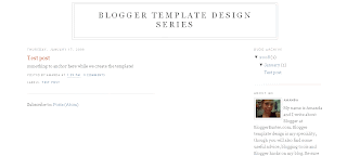
As you can see, there is now a wide gap between the posts column and the sidebar. We can fill this gap by using one of these methods:

  1. Creating a second sidebar
  2. Widening the main posts column and the sidebar

Depending on your choice of blog layout, you will need to use one of the following methods for your custom template.

Creating a three column template (with a second sidebar)

Although I have previously written a post about this method, I have decided to revamp my method here to add some extra functionality to the finished template.

In this tutorial, we will create the following dimensions in the layout:

  • Two sidebars, measuring 250px in width
  • The main posts column will be 450 px wide

This ensures regularity of each element, and will make it easier to add margins and passing at a later stage.

Change the width of the sidebar

It is easier to change the width of the existing sidebar before we add another one. To do this, open your template (no need to expand the widget templates) and find this section of code in the <b:skin> section:

#sidebar-wrapper {
width: 220px;
float: $endSide;
word-wrap: break-word; /* fix for long text breaking sidebar float in IE */
overflow: hidden; /* fix for long non-text content breaking IE sidebar float */
}

Change the line highlighted in red to this:

width: 250px

Your sidebar will now be slightly wider.

Adding the style for the second sidebar

Before we can call the secind sidebar in the blog template, we will need to add the styling for this sidebar, and make it unique.

Find and copy this whole section from your template (this is the section we modified in the previous step):

#sidebar-wrapper {
width: 250px;
float: $endSide;
word-wrap: break-word; /* fix for long text breaking sidebar float in IE */
overflow: hidden; /* fix for long non-text content breaking IE sidebar float */
}
Once you have copied this to your clipboard, paste this section of code immedietly beneath the original set of code. Then change this line in your newly pasted code:
#sidebar-wrapper {
To say this instead:
#new-sidebar-wrapper {

This is the identity of the div which contains the sidebar wrappers. Each div element which has an ID must be unique and should only be called once within the page. By adding the "new" part to the title of the style for the div, we can ensure the new sidebar will display properly.

If you want your second sidebar to fleat to the right of the main posts column, you can leave the styling as it is.

However, if you prefer the sidebar to appear to the left of the main posts column, you will need to change the following line:

float: $endSide;
To this instead:
float: $startSide;

This will ensure that your new sidebar will float to the left.

Calling the second sidebar in your blog template

To call the secind sidebar, we need to add a section of code to the actual template section. The location for this code changes depending on whether you wish the second sidebar to be aligned to the left or the right of the main posts column.

There are two possible locations for this second sidebar. Assuming you have not added any extra widgets to your Minima template, you will be able to find the following section of code in your Blogger template (do not expand the widget templates):

<div id='crosscol-wrapper' style='text-align:center'>
<b:section class='crosscol' id='crosscol' showaddelement='no'/>
</div>

<!-- Insert code here for left sidebar -->
<div id='main-wrapper'>
<b:section class='main' id='main' showaddelement='no'>
<b:widget id='Blog1' locked='true' title='Blog Posts' type='Blog'/>
</b:section>
</div>

<!-- Insert code here for right aligned sidebar -->
<div id='sidebar-wrapper'>
<b:section class='sidebar' id='sidebar' preferred='yes'>
<b:widget id='BlogArchive1' locked='false' title='Blog Archive' type='BlogArchive'/>
<b:widget id='Profile1' locked='false' title='About Me' type='Profile'/>
</b:section>
</div>
I have included some comments here to show where to paste the following code, depending on your choice of alignment. When you have decided where you would like your second sidebar to appear, copy and paste the following section of code in the appropriate place:
<div id='new-sidebar-wrapper'>
<b:section class='sidebar' id='new-sidebar' preferred='yes'/>
</div>

You should save your new template at this point.

There is currently no content in this second sidebar, so if you preview your blog, nothing will be displayed in it's place. But if you go to Template>Page Elements in your Blogger dashboars, you will see a new "Add page element" section. Here you can add a new widget and take a look at your blog to see how it will be displayed.

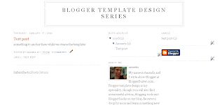
In my demonstration blog, I added the new sidebar to appear to the right of the main column which now appears like this:

Change the width of the main posts column

The final customization to this three column layout is changing the width of the main posts column slighly to make better use of the space available.

This is another simple edit. Simply find this section in the <b:skin< section of your template code:

#main-wrapper {
width: 410px;
float: $startSide;
word-wrap: break-word; /* fix for long text breaking sidebar float in IE */
overflow: hidden; /* fix for long non-text content breaking IE sidebar float */
}
Change the line highlighted in red to the following:
width: 450px;
Then save your template.

The finished result should look something like this:

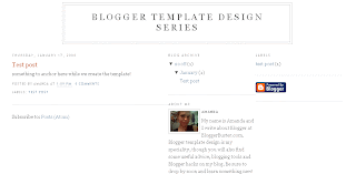
You will notice that there is no space between the sidebars or main posts column. To make space appear between each sections, we will need to use margins and/or padding in the style section, which I will demonstrate in the next chapter of the Blogger Template Design series.

Creating a wide, two column template

Creating a wider template with added space for the main posts column and sidebar is a much simpler process.

In this example, we will make the width of the posts column to 650px, and the width of the sidebar to 300px. You can change these values if you prefer, so long as the total of these two sections is 950px.

Assuming you have already changed the width of the "outer-wrapper" to 950px, you will now only need to make two small edits to the style section of your template.

Change the width of the main posts column

The width of the main posts column is defined in the following section of code:

#main-wrapper {
width: 410px;
float: $startSide;
word-wrap: break-word; /* fix for long text breaking sidebar float in IE */
overflow: hidden; /* fix for long non-text content breaking IE sidebar float */
}
Simply change the line highlighted in red to this:
width: 650px;

Change the width of the sidebar

The width of the sidebar id defined in the following section of code:

#sidebar-wrapper {
width: 220px;
float: $endSide;
word-wrap: break-word; /* fix for long text breaking sidebar float in IE */
overflow: hidden; /* fix for long non-text content breaking IE sidebar float */
}
Again, you only need to edit the line in red to say the following instead:
width: 300px;

Finally, save your template and take a look at your newly widened blog. If you have used the same values as I did, your new template should appear like this:

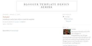
As with the three column layout, you will notice there is no space between the sidebars and the main posts column. We will work on optimizing this canvas in the next installment of the Blogger Template Design series.

Final words

For your convenience, I have made each of the template layouts described above available for download as an XML template. To download any of these files, right click on the link and choose "Save As..."

Progress of the demonstration blog

For the demonstration blog which will accompany this series, I have chosen the three column design where the two sidebars are aligned to the right. You can view the progress of the Blogger Template Design Series blog using this link.

Coming soon

In the next installment of this series, I will explain how you can further modify this basic canvas to suit your requirements. This will include modifications to the margins, padding and the header section, plus a few other elements of the blog's style.

Please consider subscribing to the feed for updates to the Blogger Template Design series, plus Blogger related news and articles as they are posted.

January 14, 2008

Essential tools for Blogger template design (Blogger Template Design Series)

When designing Blogger templates, it's useful to have a set of "tools" available before you begin. So in this installment of the Blogger Template Design series, I have compiled a list of tools I use often when designing themes, from imaging programs to relevant websites and resources you may like to use when designing your own templates.

A test blog

When building a completely customized template, I would strongly advise you to do this using a test blog. This way, you can always ensure your regular blog is available, features no mistakes and is always presentable!

I always create and test new templates on a test blog, filled with dummy posts and sidebar widgets so I can easily see what needs to be changed, redesigned or altered without affecting my main blogs in any way.

I have written a full article about creating and using a test blog which I would advise you to read before you begin to create a custom template. Then once your design is complete, you can move this over to your main blog seamlessly; your readers will barely be affected by the changeover, and your blog will always be available to read!

An image manipulation program

This is one of the key tools used when designing Blogger templates. In almost all of the themes I've created, I have needed to use an imaging program to create some aspect of the design.

Why you need this

To design a custom header image, backgrounds or perhaps headings for your sidebar. Also handy for editing images in posts.

Resources

If you already have Photoshop, CorelDraw or a similar program installed on your computer, this should be perfect for your needs. MS Paint may be a little too basic for your future needs, so if this is all you currently have available, you may want to try one of these free downloads instead:

  • GiMP (the GNU Image Manipulation Program): This is often considered the free version of Photoshop! I have used this open source program extensively, it's excellent and highly recommended.
  • Inkscape: a free vector graphics editor similar to Illustrator and CorelDraw.
  • ImageMagick: a software suite to create, edit, and compose bitmap images. Can read and write in a variety of formats.

All of the programs mentioned above have a good support system online for tutorials and usage, so if you need to learn a particular aspect of using these programs, you can be assured of answers to your questions!

A basic text editor

Although you can edit your Blogger template from within your dashboard, it can be very useful to have a basic text editor to hand too.

Why you may need this

To copy and paste elements of your template code; to save templates in text format; to write and edit JavaScript; to experiment with CSS.

Resources

I imagine the majority of you will already have a basic text editor such as Notepad already installed on your computer. This is perfectly suitable for creating and editing Blogger templates.

If you're looking for a more fully featured program, you may want to consider downloading Notepad ++ (as recommended by Thomas) which is a more advanced text editor useful for general programming needs.

Online file hosting

Blogger does not allow us to host background images or scripts in our accounts. Therefore you'll find it very useful to have a hosting account online for the images (and possibly JavaScripts) which you'll use in your custom template designs.

Why you may need this

If you want to use background images, use scripts in your template, or link to any external files.

Resources

If you already have some hosting available through your domain provider or other paid service, this will be more than suitable for your needs. You may also be able to use your Google Pages account for some files.

Here are some free hosting services you can use to host your images and files:

  • Photobucket: for images only, but highly recommended
  • HotlinkFiles: this free service can host almost any type of file, and comes with 8000mb of bandwidth.
  • Fileden: comes with 1gb of storage space! More than enough for use with Blogger templates.

More than one internet browser

Or at least the ability to check your designs in other browsers!

Why you need this

Websites can look different when viewed through different browsers. Some aspects of web design are incompatible between Internet Explorer (particularly IE6 and below) and Mozilla based browsers (such as Firefox).

If you can install more than one browser, this would be highly useful to check for incompatibility issues.

I use both Internet Explorer and Firefox to ensure compatibility between these major browsers, and also check for other possible issues using BrowserShots.org.

Resources

I imagine that most of you will already have Internet Explorer or Safari preinstalled on your computer, so here are a couple of Mozilla based browsers you may like to consider downloading:

  • Firefox: one of the most popular browsers available.
  • Flock: similar to Firefox with an emphasis for social network users

Another way to check for incompatibility issues is to use BrowserShots.org: this is a free service which provides screenshots of your web pages in different browsers. You may have to wait some time for the screenshots to be available, but this is such a good service that it's worth the time and effort!

Copyright-free images, backgrounds and icons

If you're a whiz with the camera and graphic design software, you wouldn;t need to worry about this at all. For may of us though, it's useful to have resources available for copyright-free images and backgrounds!

Why you may need these

For creating a custom header, template backgrounds, header icons, fancy lists and other decorative aspects of your template.

Resources

Here are some of the best resources I have found (and use often!)for resourcing images, backgrounds and icons:

  • Stock Exchange: features thousands of professional, copyright-free photographs. You will need to register for this site, but it is well worth it!
  • Flickr Creative Commons search: find photographs and other images you can use according to their license. For a great overview of using Flickr images, have a read of Skellie's excellent article.
  • Squidfingers patterns: over a hundred high quality tileable web backgrounds (my favorite resource for backgrounds).
  • RepeatXY: literally hundreds of backgrounds available, which you can filter by color.
  • Iconlet: a search engine for icons to use in your designs. Many sizes available, from 16x16px right up to 256x256px. A wonderful resource and certainly worth a bookmark!
  • Icons, buttons and templates (Smashing Magazine Round Up): I often find myself referring to this excellent round up of web design tools. On this page you'll find a plethora of links to other resources, and some of the best icon sets available at this time.

Free fonts

While fonts are not exactly essential, I do find that having a variety of fonts available can help me design better headers and logos for my templates, and think you may find these resources useful too.

Why you may need these

Most particularly for creating your own header images, though also useful for logos and sidebar headings.

Resources

Here is a selection of the sites I visit when looking for free fonts:

  • DaFont.com: probably the best free font resource I've discovered to date. You can search by type or keywords, and can also find commercial fonts if these are better suited to your needs.
  • SimplyTheBest Fonts: Another great resource for free and shareware True Type fonts.
  • Smashing Magazine fonts category: lists articles from the blog regarding free fonts and usage. You'll find loads of quality downloads here!

Final thoughts

I hope you find this a useful resource for when creating your own Blogger templates. If you would like to add any other resources to those listed here, please leave a comment below or send me an email.

In the next few days, I will make both this article and the Cheats' Guide to Customizing Blogger Templates available as PDF downloads for easy accessibility.

Coming soon...

In the next installment of this series, I'll (finally!) get into the nitty-gritty of template design. The next post will focus on creating a three column canvas on which to base your new design. This will be slightly longer and more detailed than my previous "creating a three column template" article, as I will fully explain how to adjust margins, padding and alignment to suit your individual requirements.

Be sure to subscribe to the news feed for updates on the Blogger Template Design series and other blogging news. And as always, please feel free to leave your comments and suggestions below.

Advertise on Blogger Buster

Browse through the Archives

All existing posts are still available to view while I'm working on the site, albeit seen in a much simpler interface. Feel free to browse through the archives to find tutorials, templates and articles to help you build a better blog:

Blog Archive

© Blogger Buster 2010 Home | About | Contact | Hire Me | Privacy Policy